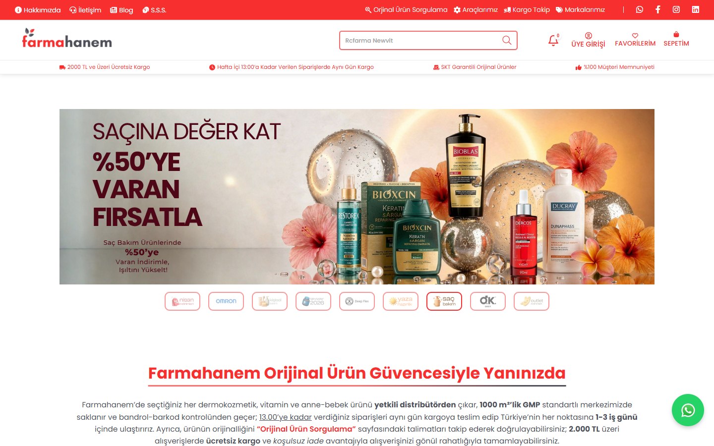
Farmahanem
Brand Identity · Web Design

The project came together with data visualizations that follow the most up-to-date reporting standards, highly readable typography selection and a color palette compatible with the corporate identity. The page flow is optimized for both online reading and print distribution; Thus, TİKA's development projects were presented with a clear, understandable and strong story line.
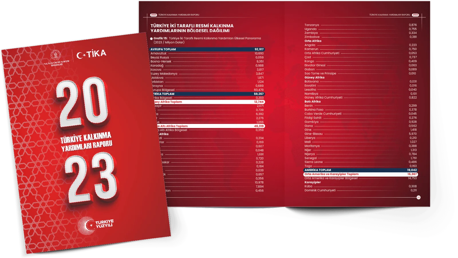
Each section of the report welcomes the reader with detailed graphs, summary information boxes and simple infographics. Thanks to its interactive PDF structure, it is possible to access important indicators with a single click. In this way, TIKA's global contributions have turned into an eye-catching reference source for decision makers and stakeholders.
While preparing TİKA's 2023 development assistance report, our focus was to explain complex data in a simple and impressive visual language. Corporate colors were used strategically, legible fonts and wide line spacing offered a tiring experience even with long texts. A fluid transition between sections, thematic divisions and infographics was achieved in the page layout. Interactive links and built-in content map made the report a document not just to read but also to explore. In the final stage, detailed checks were carried out for file size, accessibility tags and print compatibility. Thus, TIKA offered its global stakeholders a powerful resource that conveys reliable data with a modern design approach.
Brand Identity · Web Design
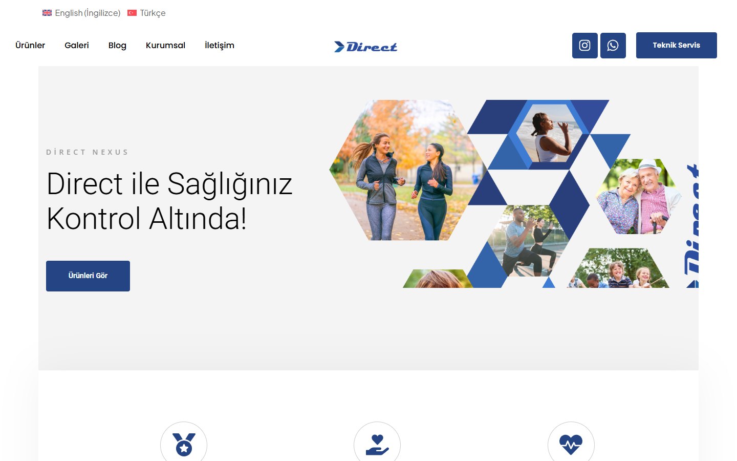
Brand Identity · Digital Marketing
Web Design · Software
Let's listen to your brand's needs.
Let us bring design, software and marketing together for you.